Cartography – How We Shape the World Through Maps
Written by Susana Martins Marques, NOVA IMS
“Maps are the places where stories live” - Rebecca Solnit, Writer & Cultural Geographer
Since ancient times, humans have used maps to navigate land and sea. Early mapmakers used tools to estimate positions and drew maps by hand, guided by stars and stories. Today, most of us rely on GPS or a map app to find our way — with a tap on a screen, we’re guided through cities, forests, or mountain trails.
But how did we get here? What’s behind the scenes of the maps we so easily use today?
From Clay Tablets to the High Seas
One of the oldest known maps is the Imago Mundi, also called the Babylonian Map of the World, created around the 6th century BCE. Found on a clay tablet in Sippar, Iraq, it shows how Babylonians visualised their world.
These early maps show us how people understood the world around them. Centuries later, during the Age of Discovery, the boundaries of that world expanded dramatically.
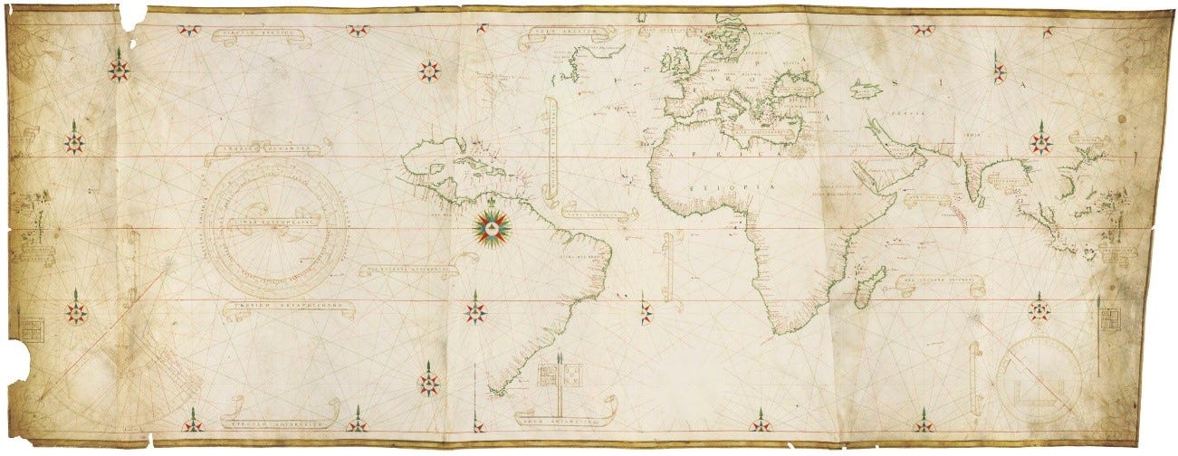
The Castiglione Planisphere of 1525, attributed to Diogo Ribeiro, reflects a new global awareness shaped by explorers like Fernão de Magalhães (Magellan). This map, deeply influenced by Portuguese exploration, is a favourite of mine — perhaps because I’m Portuguese, and the spirit of discovery runs in our veins.

Cartography has evolved from ancient times and has created beautiful and reliable maps. Throughout time, colours, symbols, and other features have marked the growth of cartography.
How did these maps become so sophisticated? Well, with a lot of work!
Turning a Round World into a Flat Map!
As cartography evolved, one big challenge emerged: how to accurately represent a 3D Earth on a 2D surface. That’s where coordinate systems come in.
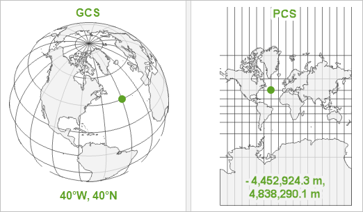
The Geographic Coordinate System (GCS) defines positions on Earth using latitude and longitude — perfect for a globe. But most of our maps are flat. To go from globe to map, we need a Projected Coordinate System (PCS), which transforms angular coordinates into linear ones.
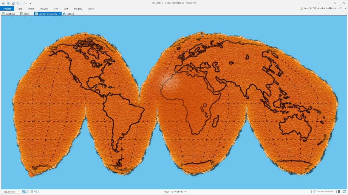
This seems complicated, but the best way to visualise it is to imagine that the world is an orange and you then peel it and flatten the peel on top of a table: that is your projected surface. Check this ArcGIS Blog that describes this perfectly.
What are the main differences? Here are some key points to consider:
🌍 GCS
Definition: A coordinate system that uses a three-dimensional spherical surface to define locations on the Earth.
Coordinates: Latitude and Longitude (angular measurements).
Units: Degrees (°).
Example: WGS 84 (used by GPS).
Use: Global positioning
Pros:
Good for global-scale mapping.
Maintains actual geographic positions.
🗺️ PCS
Definition: A flat, two-dimensional representation of the Earth using a mathematical projection of the GCS.
Coordinates: X and Y.
Units: Meters.
Example: UTM (Universal Transverse Mercator), Web Mercator.
Use: Local mapping and analysis
Pros:
Allows for linear measurement and spatial analysis.
Better for localised, large-scale maps.
The PCS helps map makers create the best possible 2D map for the area that they need to show, reducing the error while calculating the linear coordinates. Of course, this means that even if this area is perfectly shown on a map, other areas around this one might be distorted, depending on the type of map projection you choose; this is the trade-off of using PCS.
We have many different map projections. For example, conic projections — like Albers Equal Area or Lambert Conformal Conic — are often used for regional maps. Cylindrical projections — such as the widely known Mercator or its Universal Transverse Mercator (UTM) variant — are common in navigation and web mapping.
All of these projections are mathematical calculations that help project our world – Every map is a geometric projection of the Earth: there's no other way to represent a 3D object on a 2D plane. This means that no map can ever be a perfect representation of reality—there will inevitably be compromises. And every compromise carries implications. By definition, every projection will have distortions: some countries or regions will appear larger or smaller than their actual size. What gets placed at the center? What's relegated to the margins?
A great resource that shows how each projection distorts the world differently is the Map Projection Transitions tool by Jason Davies — an interactive visualizer.
From ancient clay tablets to the GPS apps in our pockets, maps have always been more than just guides — they are reflections of how we see and shape the world. Understanding what goes into making them reveals just how complex — and beautiful — the art of cartography really is.
Useful Links and News 🗞️
📝 Apply for Sustaining Environmental Stories : A Workshop on Innovative Environmental Storytelling (You have time until the 6th of June!)
Are you a photographer or journalist working on environmental stories? Will you be attending the Professional Week at Les Rencontres d’Arles (July 7–9, 2025)? Apply for a free 4 day hybrid workshop, designed to equip visual storytellers and journalists with essential investigative skills to bring environmental stories to a wider audience.
🗺️ Discover this free MOOC on cartography!
🌍 Worldmapper: a collection of maps online
Worldmapper is a collection of world maps called cartograms, where territories are resized on each map according to the subject of interest.
How did you like this issue? Let us know!
We’re always open to comments, suggestions and tips.
Feel free to reply to this e-mail and let us know what you’d like to read next.
See you soon - and don’t forget to follow us on LinkedIn!


